PiinPoint Map tool
Helping businesses understand places
I worked as PiinPoint's lead designer during their time at YCombinator's Winter 2014 batch. I was responsible for all things design, from talking to our users to coding the front-end.
RadioShack has recently decided to close more than 500 stores while the Gap has closed 20% of its locations in the last few years. With increasing competition from online retailers, understanding store locations is more and more important.
I spoke with small business owners and executives of large retailers. These user interviews helped me understand their pain points and how they use our product.
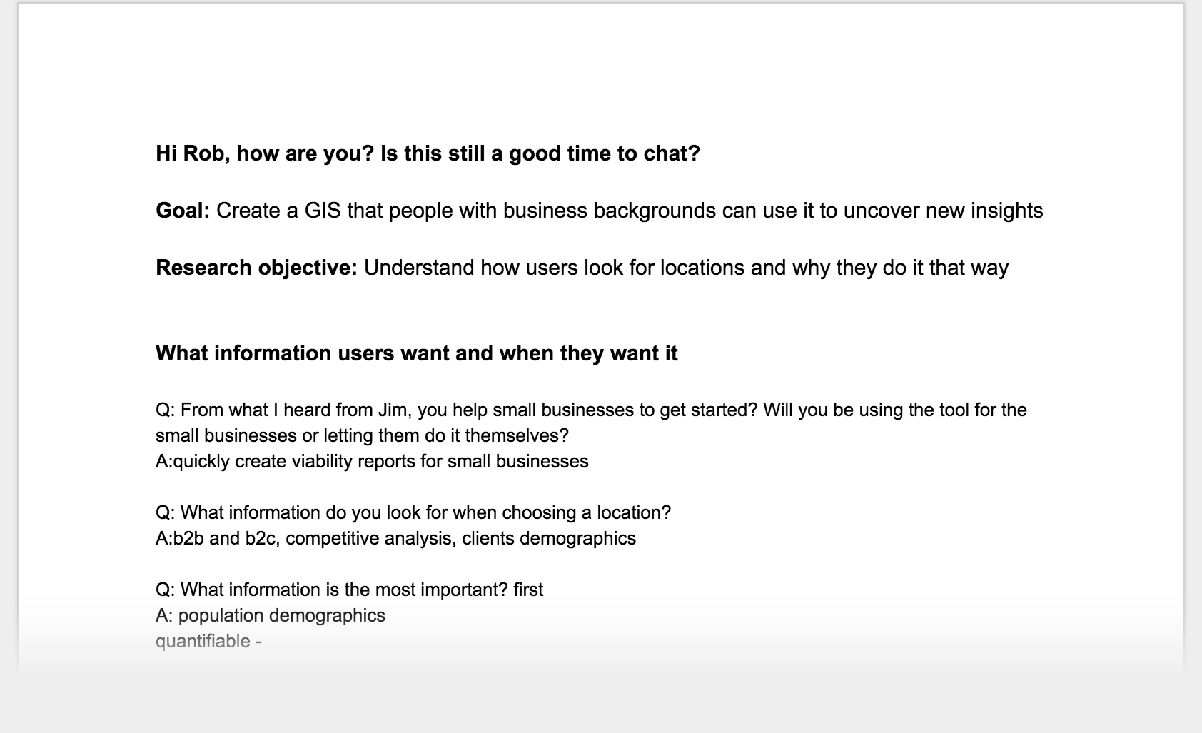
The problems our users faced were actually very different depending on the size of their business, but they all want the process to be faster.
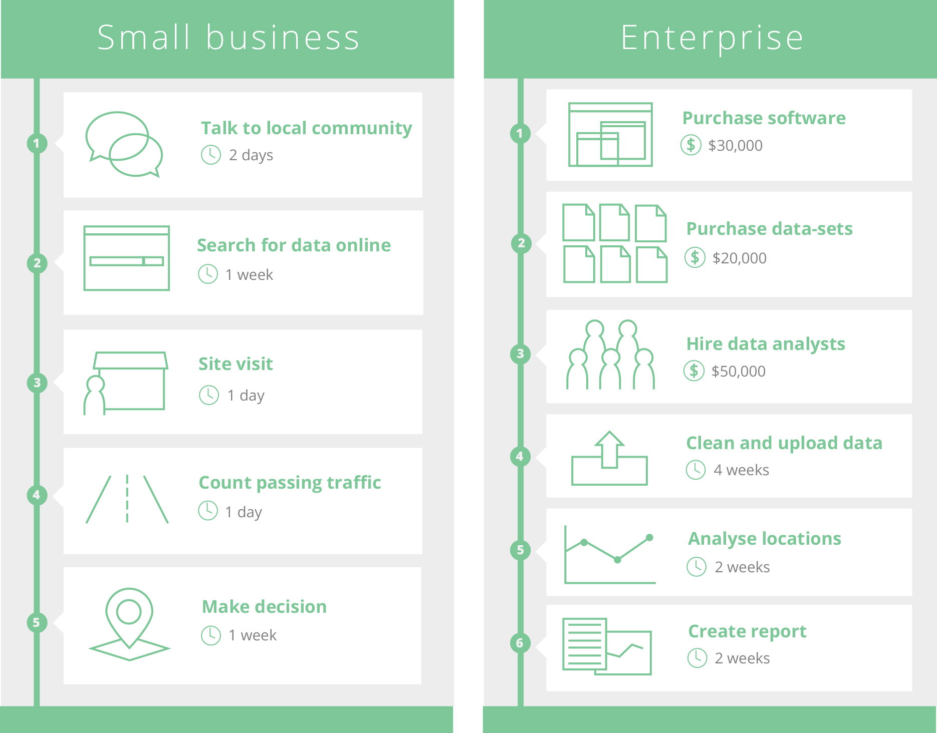
Small businesses rely on free data. They use Google to search for competitors, government websites to look for census data and real estate listings to find potential locations. Business owners spend a long time collecting and organizing these data.
Larger businesses buy data. They use slow and complicated GIS software to analyse large amounts of location-based data. Analysts want an easier way to work with the data and a better way to present their findings to key decision makers.
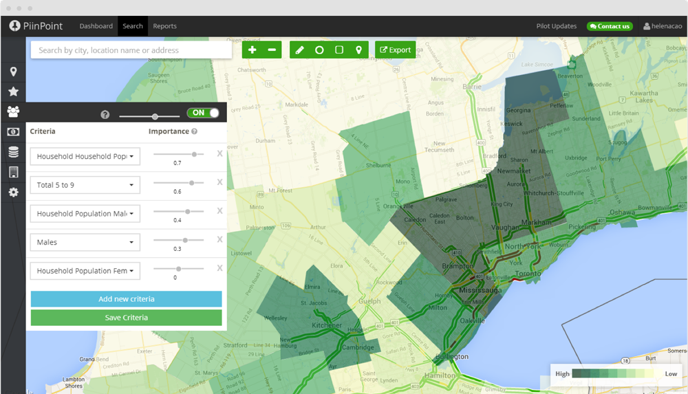
We tried to create a platform to take in a lot of location-based data and show them in a meaningful way. We automate the repetitive work so business can focus on making decisions.
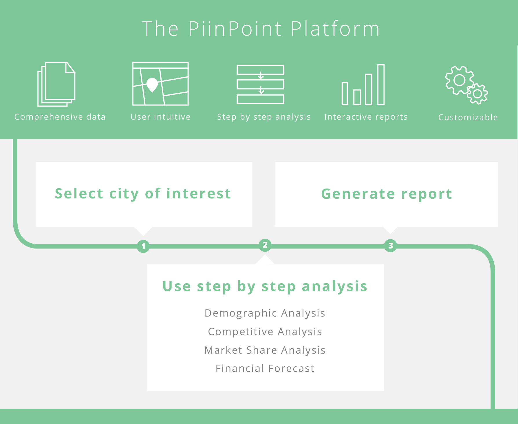
I started working on the map tool in December 2013 and went through many iterations. During demos to potential clients and industry experts, we received many compliments on the design. They were excited about the possibilities and impressed by how much the product improved in just 4 months.
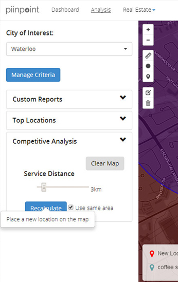
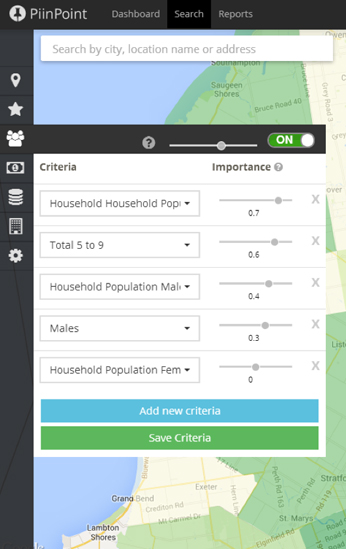
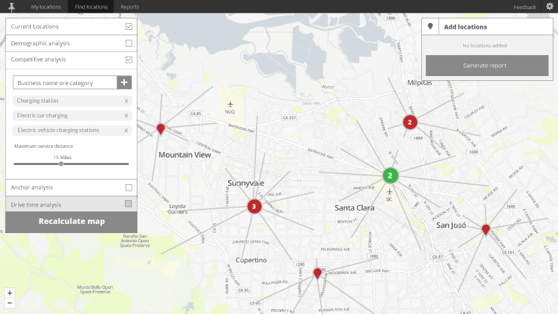
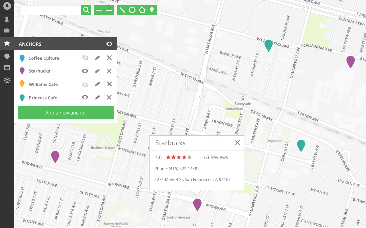
As we added more features, control panels, pop-up and legends started taking up more map real estate. Here's the map tool in Feburary 2014. All four corners of the map are filled with buttons and legends.
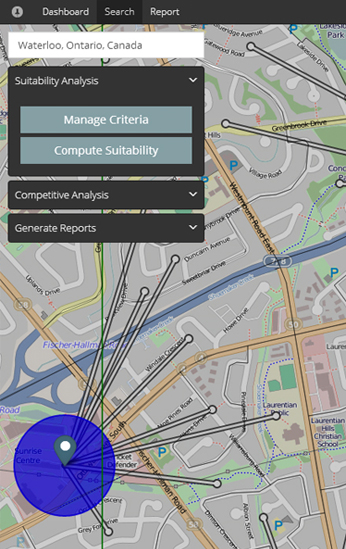
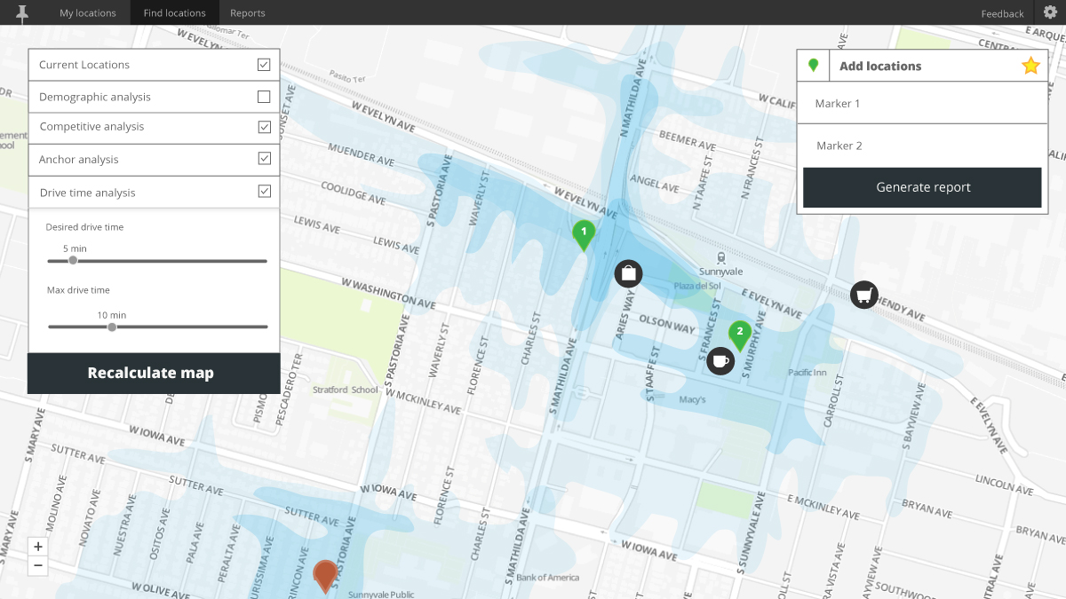
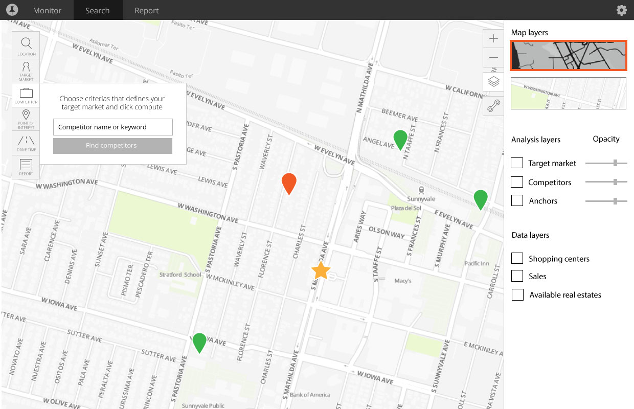
I reorganized functionalities to reduce the amount of clutter and used similar visual elements for every functionality to unify the tool. I refined the designs with some quick mock-ups in Illustrator.
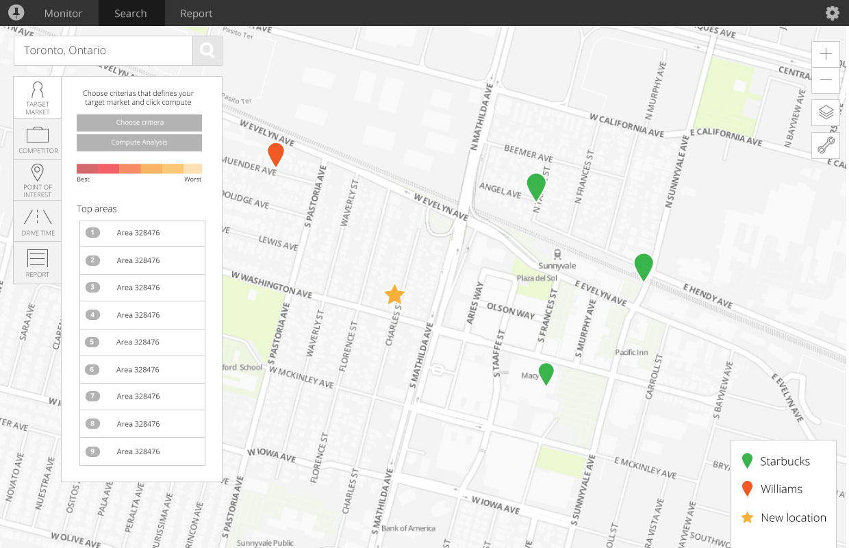
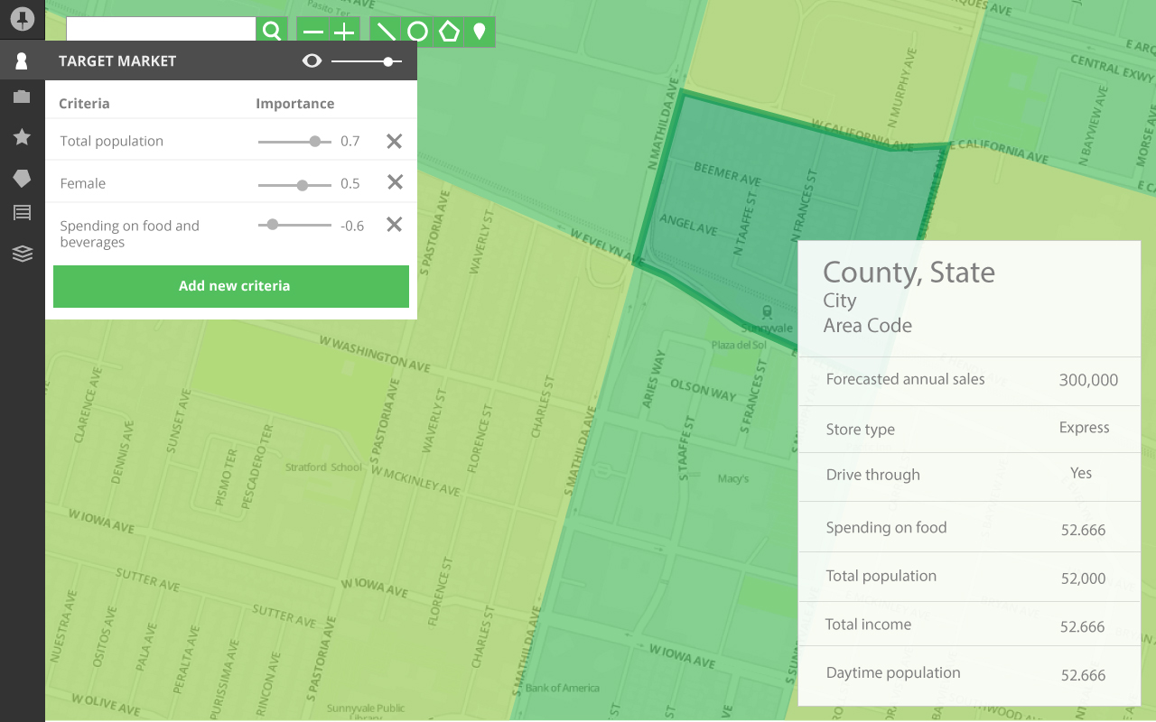
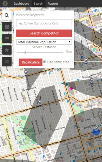
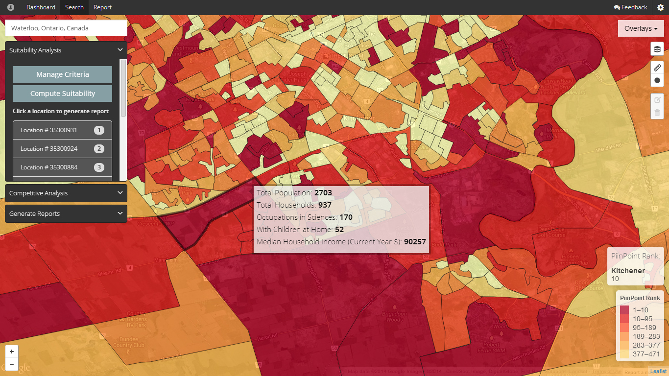
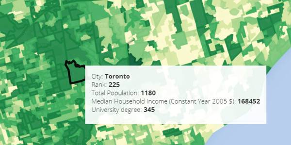
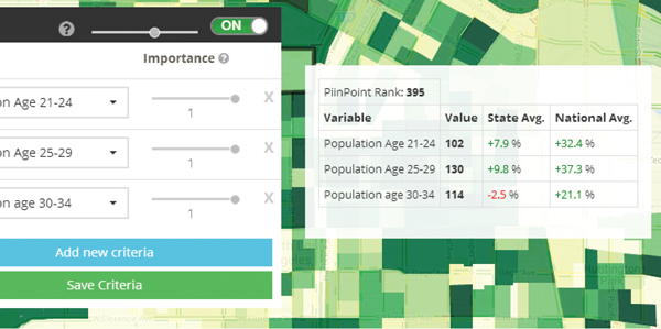
Many of the early visualizations were difficult to understand. Instead of showing how we calculated the results, we had to show results that mattered to the user.
Numbers are only useful in the right context. Initially, we thought it would be great to include the raw data for each block. Users started asking what the numbers mean and we added in the state and national averages.
I built out most of the front-end using Twitter Bootstrap, leaflet.js and jQuery. The tool was semi-responsive but we decided not to support mobile for now.
I was working a a problem I wasn't familiar with. We were launching our pilot so our users were very understanding and helpful.
I used the things I learned from these conversations to justify many design decisions. Although I spent some times doing user interviews in the beginning, so much learning actually came from interacting with the users after we launch the new features.