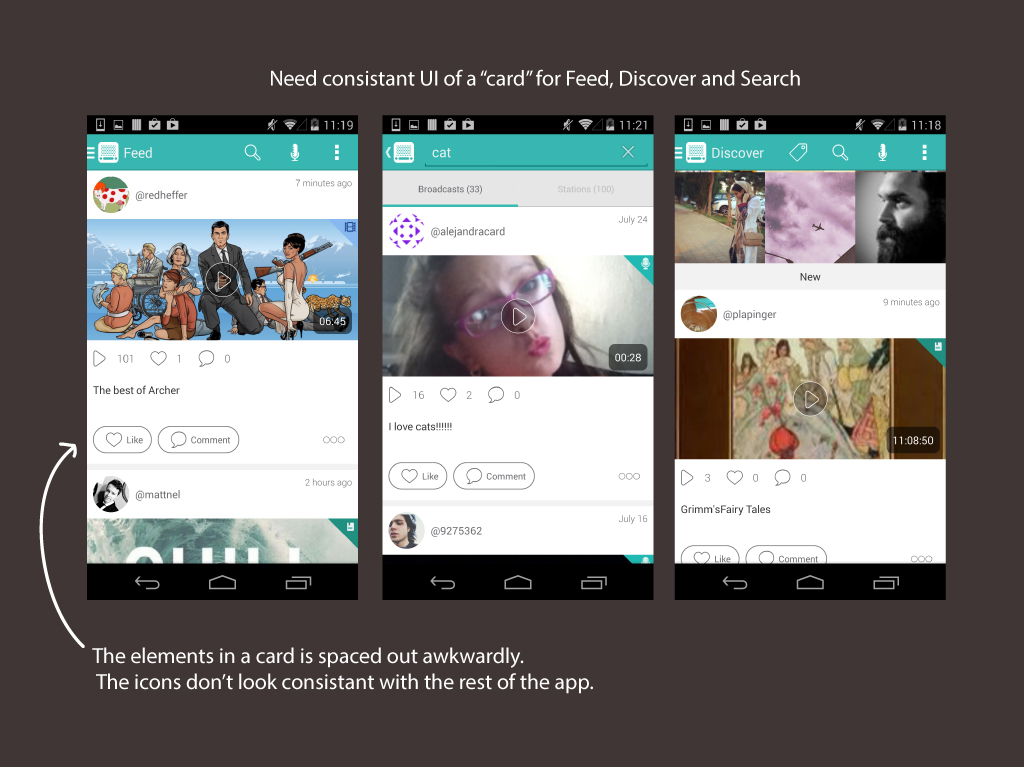
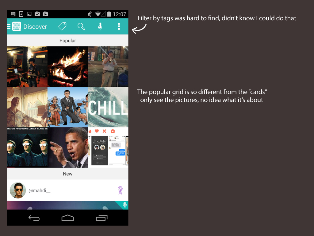
First impressions
I signed up for Instaradio, jotted down my thoughts and took screenshots along the way. I paused at at each screen to think more about what I expected and why I reacted in certain ways. Here's some selected feedback I had.
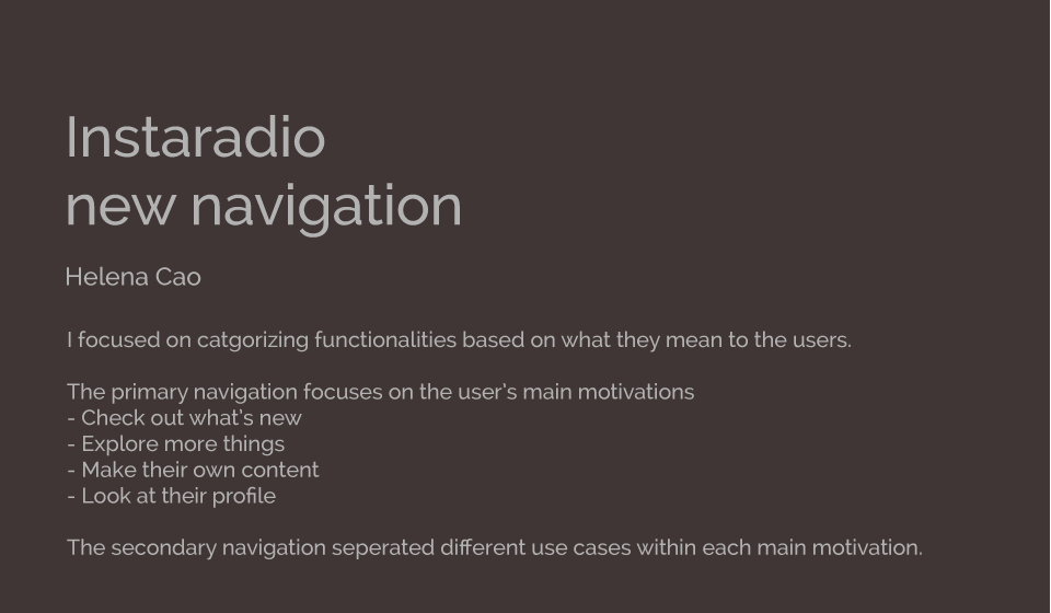
Instaradio was looking to improve their mobile experience. I walked through the application and documented my feedback. I also created some wireframes for a more intuitive navigation.
I signed up for Instaradio, jotted down my thoughts and took screenshots along the way. I paused at at each screen to think more about what I expected and why I reacted in certain ways. Here's some selected feedback I had.
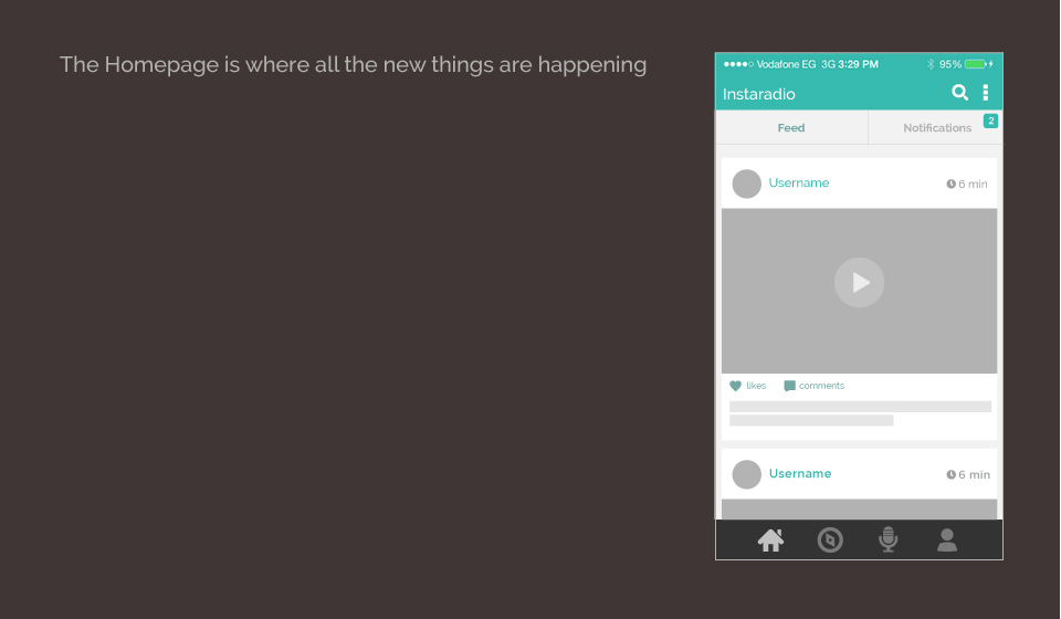
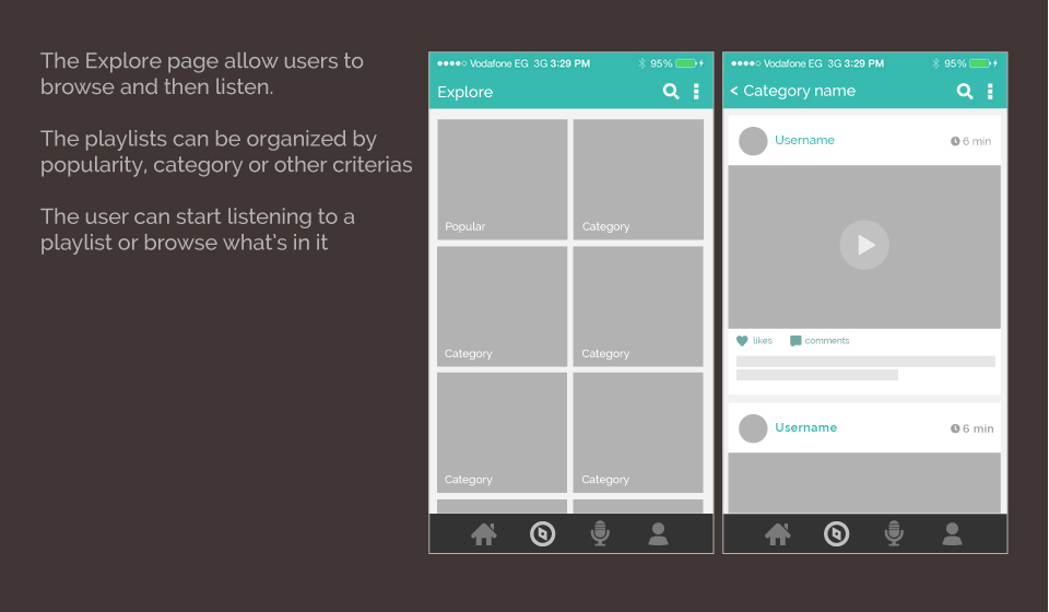
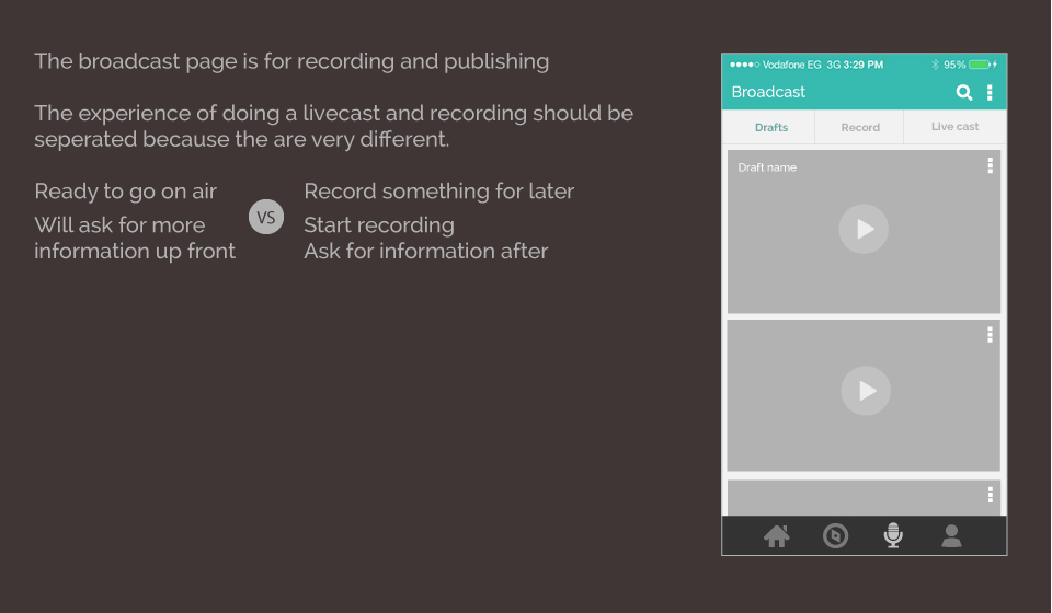
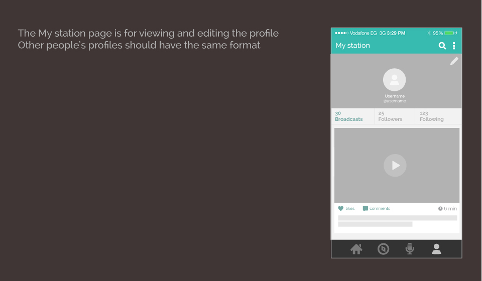
The old navigation didn't reflect the user's intentions. There was also no clear sense of hierarchy between the options.
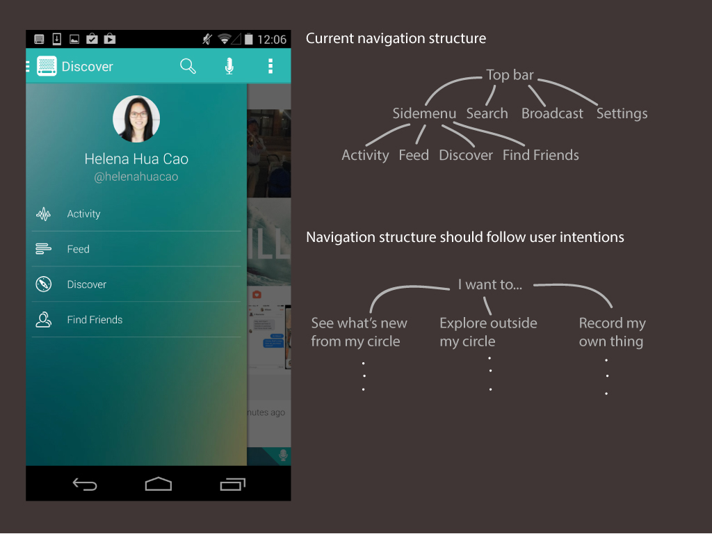
I created wireframes for a new navigation that is more aligned with the user's primary intentions.
Improving the navigation can make a huge impact to any application because that's how you get to all the features. Kevin from Instaradio said the feedback was great and "a lot of it is spot on". Although I didn't work with them on further designs, I was glad to provide some insight on such a critical part of the app.