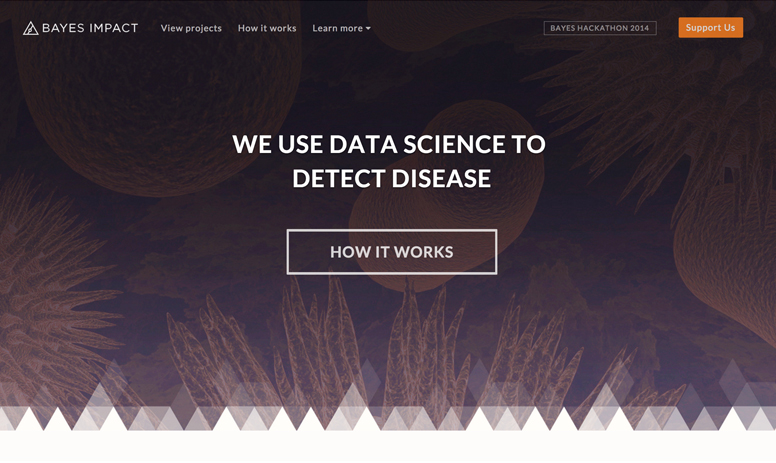
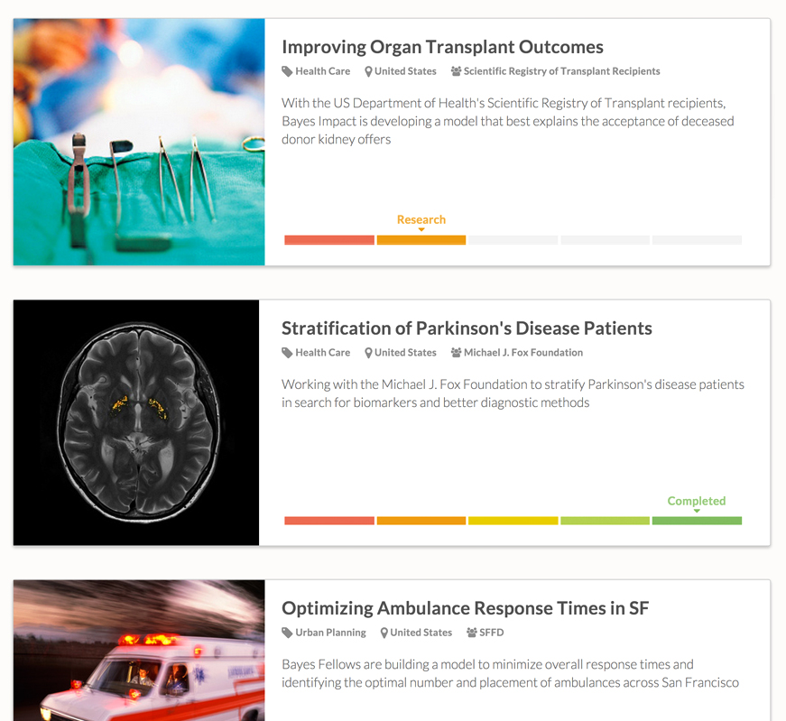
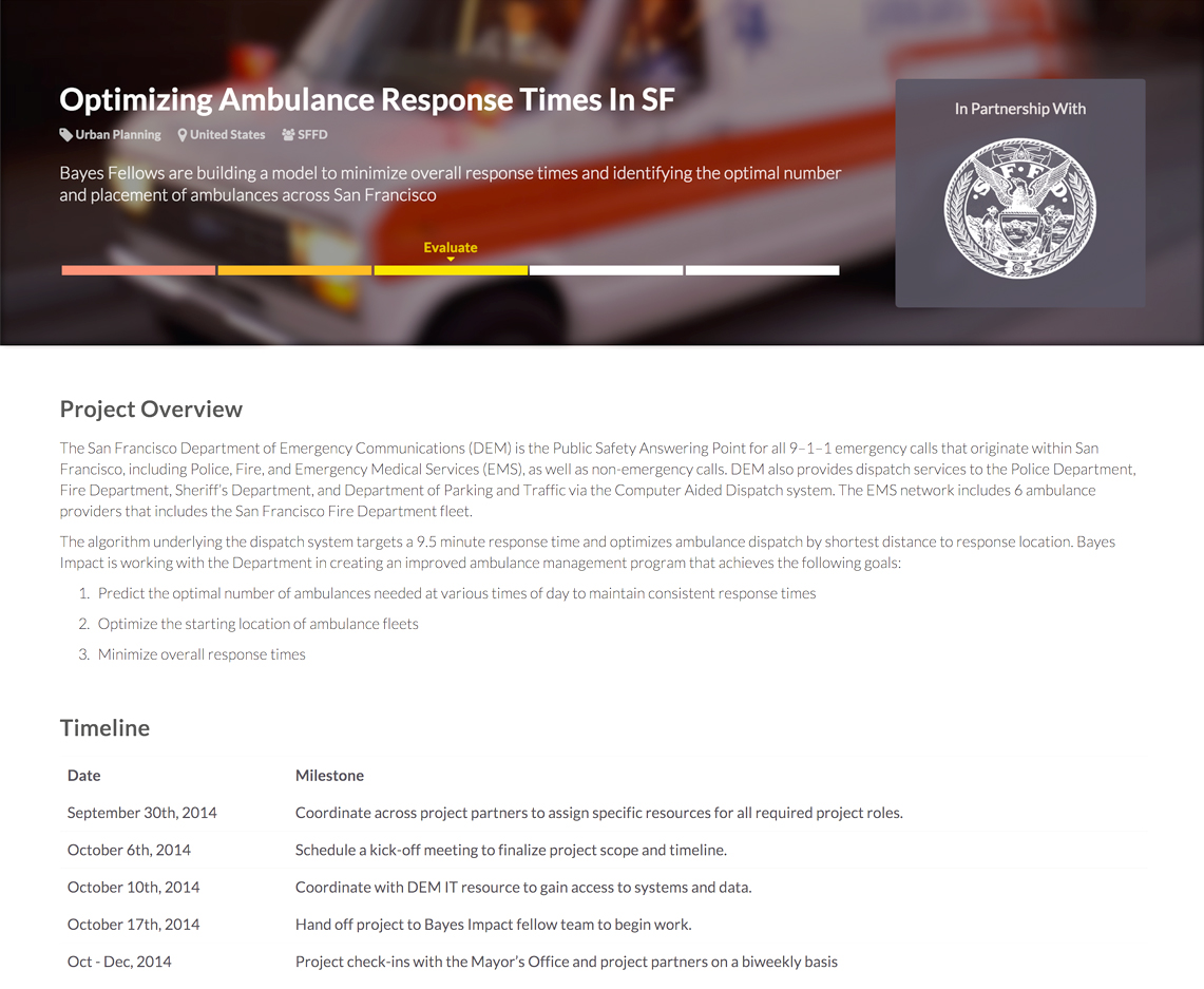
About Bayes impact

Data is making every little detail of our life better. Netflix uses data to recommend movies and Uber uses data to get you to the party faster.

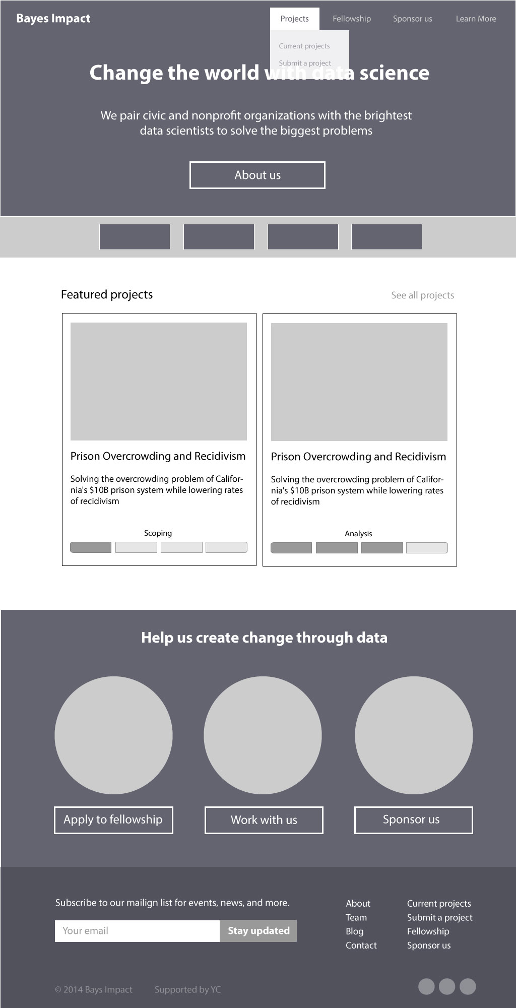
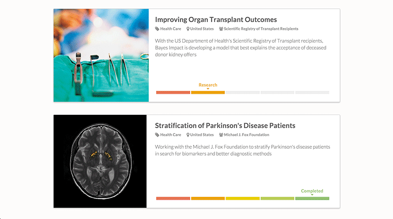
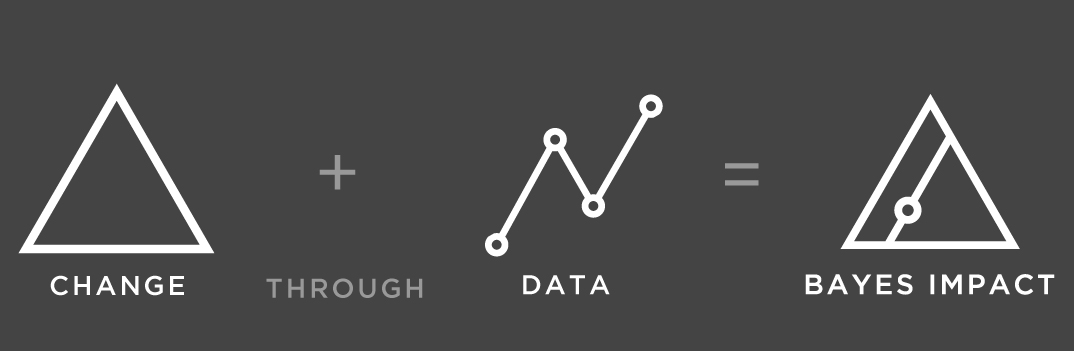
Bayes Impact uses the same data science techniques to solve big social challenges. We run a fellowship program for some of the best data scientists and work on data from many nonprofit organizations.

Website Redesign

Bayes Impact was fresh out of the YC Summer 2014 batch and needed a more polished look. I worked on the content organization, visual designs and front-end of the website redesign.

The talented Jeff Fan already created an awesome geometric logo for Bayes Impact. I loved the triangle motif and used it to add personality to the website.


Designing for impact

Bayes impact's website needed to cater to many audiences. We want the website to attract more talented data scientists, find more organizations to work with, and raise more money from donors. One thing that ties everyone together is the desire to make a difference.


Website structure

I created wireframes to plan out the website structure. To keep the navigation simple, we focused on the projects and kept the information pages under the "Learn more" dropdown.

Hero header

We used examples to show how data can change the world. By pairing each example with an image, we help the viewer see our potential.

Another important factor is keeping "We use data science to..." consistent. Although emergency response, disease prevention and poverty are very different social problems, they all can be solved with data science.


Showcasing Projects

We liked how crowdfunding websites had important metrics at a glance to show progress. We used the same concept but adapted it to our projects.

Instead of including numerical metrics, which might not apply to some projects, we opted for a progress bar to show the status of each project. Unlike many crowdfunding sites, we let each project take up the whole width of the page because they all have significant social impact and a worthy story to tell.

Responsive elements

Most of the website was content-based so it was easy to adapt to mobile platforms. I spent a bit more time working on the responsive styling for the project cards and the footer. I really like how they turned out in the mobile version.